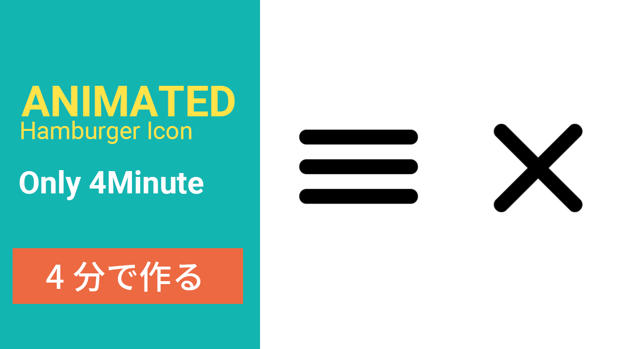
4分で作るハンバーガーメニューアイコン、HTML CSS JS
公開日:7/19/2020
今回は初心者向けにアニメーション付きのハンバーガーメニューの作り方を説明していきたいと思います。
関連動画はyoutubeにも公開していますので良かった是非みて見てください。
ファイル作成
それぞれ index.html , syle.css , main.jsファイルを作成します
HTMLの構造
vscodeの場合htmlファイルを作成した後に ! を入力してエンターたたくと自動でhtmlテンプレートが表示されます
<!DOCTYPE html>
<html lang="en"> <!-- ここをlang="ja"に変更 -->
<head>
    <meta charset="UTF-8">
    <meta name="viewport" content="width=device-width, initial-scale=1.0">
    <title>humberger menu</title>
</head>
<body>

</body>
</html>
先ずlangをenからjaに変えましょう、次はtitleタグの中ですね、自由に変えてください、今回はhumberger menu にしておきます。 次はcssスタイルとjsがちゃんと当たるようにlinkタグとscriptタグを追加します。
<!DOCTYPE html>
<html lang="ja">
<head>
    <meta charset="UTF-8">
    <meta name="viewport" content="width=device-width, initial-scale=1.0">
    <title>humberger menu</title>
    <link rel="stylesheet" href="style.css">
</head>
<body>
    <script src="main.js" defer></script>
</body>
</html>
ちなみに、script タグに書いてあるdeferはhtmlが全部読み込まれた後にjsファイルを読ませるためです。
次は要素作っていきます。 ハンバーガーメニューの3つの線ですね。bodyの中に以下を追加します。
    <div class="icon-wrapper">
        <div class="icon-item line1"></div>
        <div class="icon-item line2"></div>
        <div class="icon-item line3"></div>
    </div>
ここで定義しているクラスを使ってcssで整っていきます。
CSSの構造
style.css
*{
    box-sizing: border-box;
}
html,body{
    height: 100vh;
    width: 100vw;
    padding: 0%;
    margin: 0%;
}
body{
    display: flex;
    justify-content: center;
    align-items: center;
}
.icon-item{
    height: 10px;
    width: 80px;
    background-color: black;
    border-radius: 25px;
    margin-bottom: 10px;
    transition: all 0.5s ease;
}
.icon-wrapper{
    cursor: pointer;
}
.show-animate .line1{
    transform: translateY(20px) rotate(-45deg);
}
.show-animate .line2{
    opacity: 0;
    transform: translateX(50%);
}
.show-animate .line3{
    transform: translateY(-20px) rotate(45deg);
}
見やすくするためにbodyをflexにしていハンバーガーメニューを画面の真ん中にしています、 状況によってここを消して大丈夫と思います。👇
body{
    display: flex;
    justify-content: center;
    align-items: center;
}
.icon-itemのheight,widthも大きくしています、そこも状況によって変えてください。 次はjsですね、クリックされたら、アニメーションが実行された、xになるようにしていきます。
main.js
let icon = document.querySelector('.icon-wrapper')
icon.addEventListener('click',()=>{
    icon.classList.toggle('show-animate');
})
簡単に説明すると、先ずをDOMを使ってicon-wrappepクラスを持つ要素を取得し、それにアクションクリックイベントを追加し、クリックされた時の処理として、新しcssクラスを追加されるもしくは削除するような流れです。
以上です。
完成コード
index.html
<!DOCTYPE html>
<html lang="js">
<head>
    <meta charset="UTF-8">
    <meta name="viewport" content="width=device-width, initial-scale=1.0">
    <title>humberger menu</title>
    <link rel="stylesheet" href="style.css">
</head>
<body>
    <div class="icon-wrapper">
        <div class="icon-item line1"></div>
        <div class="icon-item line2"></div>
        <div class="icon-item line3"></div>
    </div>
    <script src="main.js" defer></script>
</body>
</html>
style.css
*{
    box-sizing: border-box;
}
html,body{
    height: 100vh;
    width: 100vw;
    padding: 0%;
    margin: 0%;
}
body{
    display: flex;
    justify-content: center;
    align-items: center;
}
.icon-item{
    height: 10px;
    width: 80px;
    background-color: black;
    border-radius: 25px;
    margin-bottom: 10px;
    transition: all 0.5s ease;
}
.icon-wrapper{
    cursor: pointer;
}
.show-animate .line1{
    transform: translateY(20px) rotate(-45deg);
}
.show-animate .line2{
    opacity: 0;
    transform: translateX(50%);
}
.show-animate .line3{
    transform: translateY(-20px) rotate(45deg);
}
main.js
let icon = document.querySelector('.icon-wrapper')
icon.addEventListener('click',()=>{
    icon.classList.toggle('show-animate');
})
GIF

・・・